Followers

Thursday, 5 November 2015

Dorset

Back in summer this year I took a trip down to south England, Dorset and went camping, so naturally I took up this opportunity to shoot a small collection of images just in case I may need them in the future. When me and my friends arrived, the campsite was sat on top of this beautiful hilltop overlooking the beach and a campsite below, which I saw as a perfect setting for a landscape so being a photographer interested in nature photography, I took the opportunity to take the shot. It wasn't until later on that I realised that the direction I was looking was towards the west, which also meant that stepping out of my friend's caravan at 6 o'clock in the evening I was absolutely stunned by this beautiful sunset scene. Below was the outcome of this happy accident:


This photo also marks a very special day in my photography life. This very photo above, was the first ever print I ever sold. The print was sold for £30 and I am very keen to continue to prints of my work.

The next day after I took my masterpiece above, I ventured down to the beach to explore the nearby town, I had to walk down this huge hill in order to get to it, but the view from above was absolutely amazing. Here are a few shots I took on the way down.


Here are some shots from when I reached the beach:


This next part of my shoot was taken in the sea defenses that stop waves from reaching the street along by the beach called breakwaters. After I managed to climb inside the pile of huge boulders, I was able to photograph from a completely different angle and capture these beautiful photos. I love how the light is trying to break through the tiny cracks in the rocks, it kind of reminds me of a scene from Disney's animated Peter Pan movie.


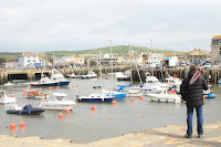
The nearby sea town was a beautiful sight. the small harbor made a beautiful scene and gave me an opportunity to exercise my skills I learnt last year for photographing boats a little bit.


Thursday, 22 October 2015

Berlin

In March 2015, I traveled to Berlin, Germany with my university course. Mainly because during this week they were exhibiting the work of the famous Andy Warhol. However, I spent much of my time simply walking around, using the public transport, and just generally exploring this new environment. Berlin is like no other city I have ever seen. It is so focused around the youth of the city and around its history, and there is a huge artistic feel for the city. Everywhere I looked I saw beautiful graffiti art, sticker bombed lamp posts, and qwerky looking designs for buildings and transportation. However, the history lives so strongly within this city and it gives it a very negative atmosphere within it.

I ran into so many drunk and homeless people, and I was amazed by how I felt just by looking at people's emotions on their faces. It was no where near as "alive" as London or Rio, and I felt like the city still suffered from the result of the second world war. Nevertheless, I tried to capture the historical side to this beautiful city.
The Reichstag, Berlin 2015

Brandenburg Gate, Berlin 2015 


"Checkpoint Charlie", Berlin 2015 


One of the main historical memorials in Berlin is the Holocaust memorial sculpture. The sculpture is made up of huge marble blocks that get bigger and bigger as you venture towards the middle of the installment. Each block is supposed to represent the grave of the Jews who died in WWII, the taller blocks in the center of the installment represent more of the Jews that passed than the smaller blocks towards the edge of the sculpture.

From a photography point of view, experimenting with light, shape and form with this installment was absolutely stunning. There was something about this dark memorial of such a terrible time that gave it a spooky, aroma.


An over look of this permanent  installation for the Holocaust memorial. It appears that each marble block is of similar size, but when you venture into it, the ground is sinking so you go deeper and deeper underground and the blocks can reach up to approximately 10 feet tall.


This is a photo I took as a part of my university studies whereby we were required to shoot and create a magazine about anything that we wanted. I decided to headline this issue with "Losing touch with reality". The magazine followed my own ideas and other people's views on how technology was drawing us away from reality and we are living in an age where technology forms our identity.


During my visit to Berlin, I of course had to visit the famous Berlin Zoo. Unfortunately the weather was not on my side for this shoot, however, I hoped that my editing techniques would allow me to. (Photos to come)

Tuesday, 21 January 2014

Child Abuse

For this section of work I used my sister as a model, allowing me to relate to my work because i was able to picture how I would feel if my sister was abused by anyone. I began exploring the theme very simply by using portraiture and mild editing. For the first photo i used the burn tool to give the bruised look to the eye, then i used to distort tool to drage the top and side of the eye tp the appripriate position in order for the eye to look swolen and i used an additional black and white layer. The second photo i used a black and white layer and added a round gradient into the top right corner of the photo. I also increased the contrast and brightness.
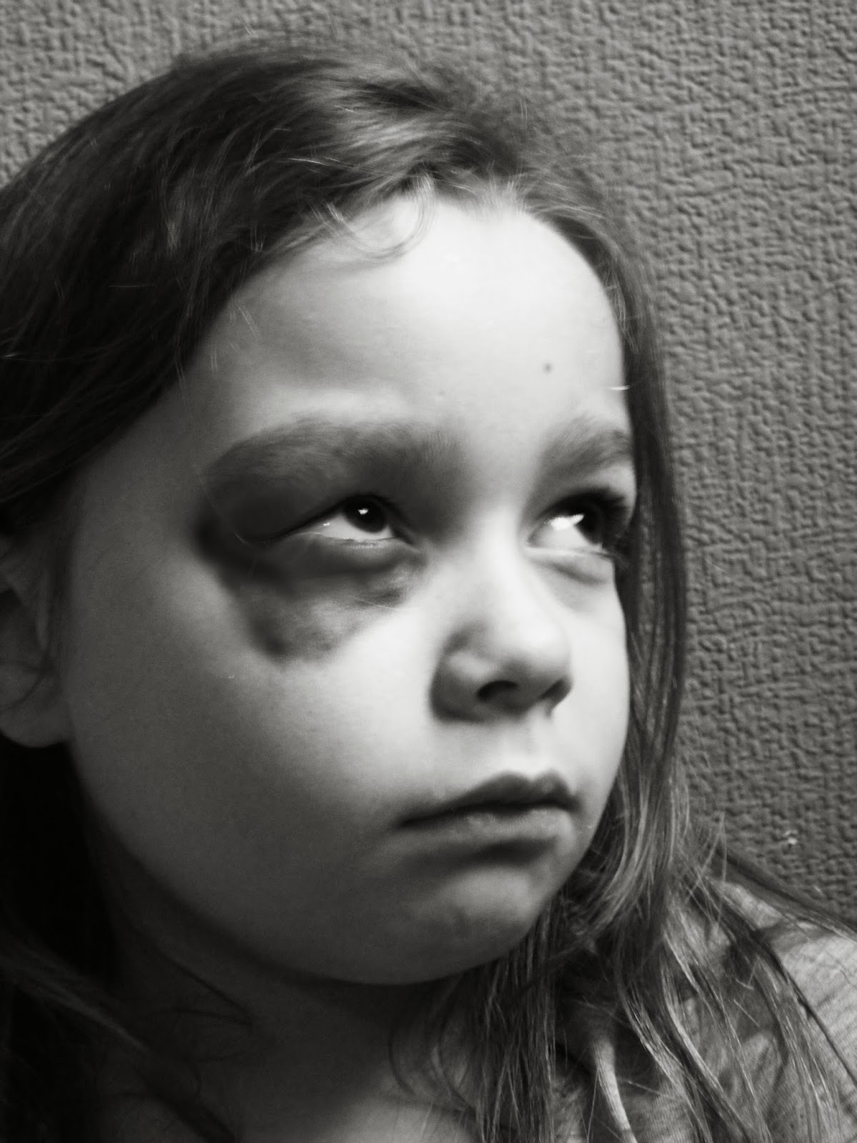


However, with my work i wanted to have the ability to project my ideas to my audience quite openly, which i wasnt really achieving with the photos i had already taken so i decided to start trying to make my photos look a little bit more like posters or TV adverts.This is one of my favourite photos because it reminds me of an advertising poster that you would find on a wall in the street or some public toilets.


For this photo, i took my initial idea of making my photographs look like posters and adverts and enterpretted an idea from a poster i found online. The editing i did was done by using the burn tool to create the bruising and i used the dublicate tool to copy the skin around her face to cover her mouth with.


This is the poster I used as inspiration to create the above.


Monday, 20 January 2014

Boats

For this section i have explored Boats. I traveled to my friend's 37ft motor boat in Southampton, whereby we spent the day travelling along the coast of southern England. This is the first photo I took during that day. I love how the sun is bouncing off the surface of the handle and how i caught the angle just right, also allowing for a nice looking landscape in the background. of the bridge and vegetation. The only thing i would change about this photo is that I've caught the end of another boat on the edge of it, however in some ways i think it gives a good effect.

This is one of my favourite of all of my photos in the section of my work, i love the colour, the contrast, the brightness and the composition of it. In real life (without the editing) this boat looked dead and boring. This is why i love how i have edited this photograph. It shows how much life and contrast that this tiny, insignificant dull and boring boat actually has on its surroundings and environment.


I love the colour in the water in this photo and the vibrancy of it. i thought it was an interesting idea to look at the reflections of the boats rather than exactly what they are because it distorts the shape of it.


Friday, 17 January 2014

Graffiti

For this series of photos I traveled to London and walked along the embankment whereby i focused the majority of my photos on one of the few legal areas for graffiti in both London and the UK. I love these photos because they show the contrast and change in which graffiti (otherwise known as street art) has on the environment in which it is in. I used photoshop to increase the contrast and brightness in these photos, and then used the select tool to select everything except the graffiti and added a black and white layer to show how the street art brings life to this photo. This emphansises the importance of the graffiti in this collection of photos, like I did in my bee photos.


Graffiti Layering

For this part of my exploration of Graffiti, I layered the photos of  graffiti in which I took up in London in the skate park, over the top of objects such as snail shells, leaves, and even metal covers.


I next carried on layering however i based this next section of my work upon the work of a photographer called "Slinkachu" (Link for his blog is here: http://www.slinkachu.com/). Slinkachu used tiny figurines to create mini scenes in which he then photograped. However instead of using figurines, I took photos of my friend at 50 different angles with a can of spray paint in his hand in order to be able to get the exact angle i needed for my photos to make it look as if he is spray painting tiny works of art onto the objects.


Thursday, 3 October 2013

Bees

Black and White Bees


In this section of my work I decided to explore the importance of bees by using an editing technique known as "selective colour". This involves using Photoshop to select a specific area of a photo and emphasise the colour by increasing things such as the vibrancy of the photo, the saturation and adding a black and white layer.


This is my favourite of this sequence of photographs. The level of detail in this photo is amazing, and the vibrancy of colour is stunning. For this photo I used a high contrast and selective colour technique.


Sunday, 29 September 2013

Water


I like to call this piece of work "Water Colour", it was taken on 16th September 2012. I took this as a part of my personal project for AS, whereby i studied the topic "water". This eventually became a candidate for my final piece. I used Photoshop to create a selective colour effect on the paint being squirted into the water. i like the paint hitting the bottom of the glass still gives a splatting effect and it shows this in the way in which it spreads around in the water.

For this piece I used coloured dyes in glasses of water. I used a mosaic effect on these 4 photos and the selective colour technique.

This photo was taken of 3 splashes of water on a desk in school. I created the colour by making a new "multiply" layer and using the paint brush tool to paint over the top of the little puddles.


In this photo i used photoshop CS5 to use the selective colour technique. For this photo i decided to use the leaves as the colour in which i was going to keep rather than the flower because it draws attention to the foreground and makes the photo more uniqe as not many photos focus on the foreground are more likely to concentrate on the midground.
 
For this photo i used a bottle with a nose spray and filled it with water, i then sprayed the flower to create water droplets on the flower, almost like crystals. i then took the photo into Photoshop and increased the contrast and created my own black and white layer. I also added a source of light into the photo in the top left of the photo.